Implementing Dark Mode in SvelteKit
How to support all modes
Contents
- Introduction
- The Rise of Dark Mode: From Luxury to Essential
- The Pitfalls of Cookies and SSR: Why It’s a Suboptimal Choice
- The Optimal Path: Local Storage, Client-Side Application, and Tailwind Integration
- The Payoff: Simplicity and Seamlessness
Introduction
In the ever-evolving world of web development, dark mode has transitioned from a nice-to-have gimmick to a fundamental expectation. Users demand interfaces that respect their eyes, battery life, and personal preferences — whether they’re burning the midnight oil or browsing in broad daylight. Modern browsers and operating systems make this seamless by exposing the prefers-color-scheme media query, allowing your site to automatically adapt to system settings and CSS frameworks such as TailwindCSS make it as simple as adding dark: prefixes to your elements classes. Problem solved, right? But what if a user wants dark mode just for your app, without flipping their entire OS? That’s where a thoughtful implementation comes in, empowering users with a simple toggle that remembers their choice across sessions.
In this article, we’ll explore why dark mode is non-negotiable in 2025, dissect the flaws in outdated cookie-based server-side rendering (SSR) methods, and guide you through a clean, local-storage-driven approach tailored for SvelteKit and TailwindCSS but easily adapted to other styling systems. Done right, this method is straightforward, efficient, eliminates any flash of unstyled content (FOUC), syncs effortlessly across browser tabs, and leverages Tailwind’s powerful dark variants for minimal CSS bloat.
The Rise of Dark Mode: From Luxury to Essential
Dark mode isn’t just about aesthetics—it’s about accessibility and usability. Studies show that over 80% of users enable it for reduced eye strain, especially in low-light environments, and it can extend battery life on OLED displays by up to 30%. With WCAG guidelines emphasizing contrast and theme flexibility, ignoring dark mode risks alienating a significant portion of your audience.
Out of the box, TailwindCSS taps into system preferences via the prefers-color-scheme query, letting you style elements like bg-white dark:bg-gray-900. This means your SvelteKit app can mirror the user’s OS without any JavaScript. However, for those who prefer a site-specific override—say, keeping their system light but your blog dark, a manual toggle is crucial. Users shouldn’t have to tweak global settings; your app should handle it gracefully.
The Pitfalls of Cookies and SSR: Why It’s a Suboptimal Choice
A common recommendation you’ll find in older tutorials and disappointingly still being dished out in Discord by people who claim to be “senior” Svelte devs is to use cookies combined with SSR to manage themes. The workflow: On the server, read a cookie to determine the theme, add a class="dark" to the <html> tag, and serve the pre-themed page. Client-side, update the cookie on toggle.
While this avoids initial mismatches, it’s riddled with issues that make it a poor fit for modern apps:
-
Server Load and Performance Overhead: Every request requires parsing cookies and executing theme logic during SSR. In a high-traffic SvelteKit app, this adds unnecessary CPU cycles, slowing down response times and scaling costs.
-
Requires Server-Side Processing: It mandates SSR for every page on the site otherwise it won’t work. One of the features of SvelteKit is that you can pre-render pages, or have some Client-Side-Rendered only. Heck, your entire app may be a SPA / PWA - shouldn’t a basic feature work for all app types? Why would you limit it to just one?
-
Bandwidth Waste: Cookies are transmitted with every HTTP request, bloating headers with redundant data. For a simple theme preference, this is overkill—especially on mobile networks where every byte counts. It would only be used for the initial request but would then be sent back to the server for every single data load, at a time when more granular remote functions are being introduced.
-
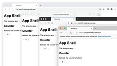
Lack of Tab Synchronization: If users have your app open in multiple tabs changing the theme will only affect the active tab that they change it in, leading to an inconsistent experience.
-
GDPR and Privacy Concerns: Storing preferences in cookies often triggers a need for consent banners under regulations like GDPR or CCPA. Even innocuous data like
theme=darkcan be seen as tracking, inviting scrutiny and potential fines. Users with strict privacy settings (e.g., via ad blockers) may lose their preference entirely. -
Cookie Expiry and Management Hassles: Cookies need expiration dates, secure flags, and domain/path configurations. Mismanagement leads to lost preferences after a set period or across subdomains, frustrating users.
-
Code Complexity: Integrating this into SvelteKit means a server hook to parse cookies, renewing them when close to expiry, and a search-and-replace of the server-generated HTML to set the appropriate theme. It also requires page-reloads when changing the setting OR client-side code to update it.
Ultimately, dark mode is a local device setting, not something that belongs on your server. It should be stored and applied client-side, keeping your backend blissfully ignorant and your app more efficient. When you do it right it will work effeciently for all variations of app that SvelteKit supports without surprises and with less code.
The Optimal Path: Local Storage, Client-Side Application, and Tailwind Integration
Treat dark mode as a browser-local concern: Use localStorage for persistence, matchMedia for system detection, and a tiny script to apply it instantly. This approach is simple (just a few lines of code), avoids FOUC by setting the theme before paint, synchronizes across open tabs via storage events, and plays perfectly with TailwindCSS’s dark: prefixes.
Assuming you’ve set up Tailwind in your SvelteKit project (via svelte-add tailwindcss), here’s how to implement it.
Step 1: Configure Tailwind for Dark Mode
In your app.css, enable the class-based strategy:
@import "tailwindcss";
@custom-variant dark (&:where(.dark, .dark *));
This lets you use utilities like text-black dark:text-white throughout your components.
Step 2: Create a Theme Store
Leverage Svelte’s runes for reactive state. A read-made implementation is available from svelte-theme-select:
import { theme } from 'svelte-theme-select';

// theme.system returns 'light' or 'dark' based on the
// prefers-color-scheme CSS media feature.

// theme.override returns 'light' or 'dark' if the theme
// has been explicitly set to a specific theme or 'system'
// to use the device OS setting. It can also be set to
// match the users preference.

// theme.current returns 'light' or 'dark' based on the
// `system` and `override` values.
This initializes from localStorage, falls back to system prefs, persists changes, and updates on OS toggles (respecting user overrides). This all happens client-side.
Step 3: Avoid FOUC with Inline Script
To avoid any Flash of Unstyled Content you need to apply the style in the <head> section of the page. A mistake many people make is to try to use onMount for this but by the time that runs (after JS scripts load and during hydration) any server-generated content will have rendered in the browser.
You can add this script to the /src/app.html file:
<!DOCTYPE html>
<html lang="en">
  <head>
    <meta charset="utf-8" />
    <link rel="icon" href="%sveltekit.assets%/favicon.png" />
    <meta name="viewport" content="width=device-width, initial-scale=1" />
    <!-- start inline script -->
    <script>
      document.documentElement.classList.toggle('dark', localStorage.theme === 'dark' || !localStorage.theme && window.matchMedia('(prefers-color-scheme: dark)').matches)
    </script>
    <!-- end inline script -->
    %sveltekit.head%
  </head>
  <body class="bg-slate-100 dark:bg-slate-900">
    <div style="display: contents">%sveltekit.body%</div>
  </body>
</html>
Or again, use svelte-theme-select which provides a Theme component you can add to your root /src/routes/+layout.svelte file which handles adding the script to the page <head> section:
<script lang="ts">
  import { Theme } from '$lib'
  import '../app.css'

  let { children } = $props()
</script>

<Theme />

{@render children?.()}
However you add it, this runs immediately, ensuring the correct class is applied before styles load — no flash!
Step 4: Add a Toggle UI
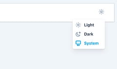
At this point you already have dark mode supported and can test it by using the Dev Tools to Emulate CSS media features. To provide a UI to allow the user to switch theme options you can either create your own to interact with the theme instance or import UI components from svelte-theme-select. Two variations are provided to place in a responsive layout, one for desktop mode and one for mobile.
Desktop Toggle with Popup
The desktop mode provides an icon to indicate the current setting and when clicked, a popup to change it. It styles the icons to show whether light or dark mode is explicitly set or are reflecting the system settings:
<script>
  import { ThemeToggle } from 'svelte-theme-select'
</script>

<ThemeToggle />
This nice thing about this
Mobile Select Dropdown
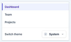
The mobile mode provides a select element to indicate the current setting and to change it:
<script>
  import { ThemeSelect } from 'svelte-theme-select'
</script>

<ThemeSelect />
Radio Buttons
Radio buttons provide a visual indicator of the selected state and buttons to change it, it’s compact form makes it suitable for desktop or mobile use:

<script>
  import { ThemeRadio } from 'svelte-theme-select'
</script>

<ThemeRadio />
Step 5: Style with Tailwind
Apply dark variants naturally:
<div class="bg-white dark:bg-gray-900 text-black dark:text-white p-4">
  <h1 class="text-2xl font-bold">Hello, Dark Mode!</h1>
</div>
Changes to the theme will be applied instantly and synchronized across all tabs.
The Payoff: Simplicity and Seamlessness
This local-first method keeps things lightweight — no server involvement means faster loads and happier devs. It avoids FOUC via early script execution, syncs preferences across tabs automatically, and integrates flawlessly with Tailwind for concise, maintainable styles. Users get full control without privacy trade-offs, and your SvelteKit app stays performant.
Ready to dim the lights? Implement this in your project today!